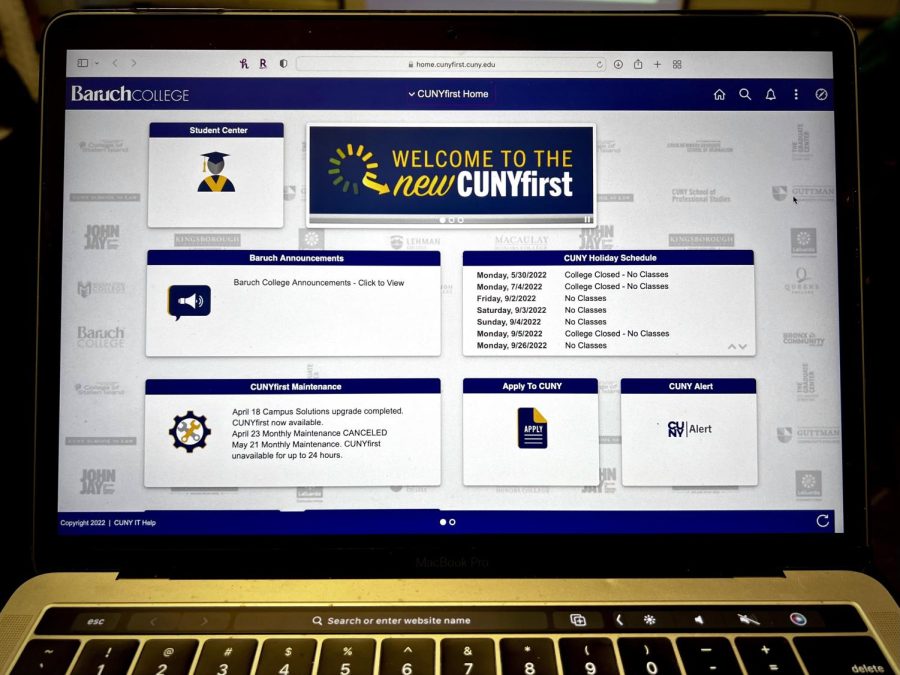
CUNYfirst receives ‘modern, tile-based’ design upgrade
April 29, 2022
CUNYfirst was updated to a “modern” design, allowing students to navigate its features using tiles rather than text menus.
The upgrade took place at the start of spring break, from April 14 to 18.
In the new CUNYfirst, students can customize their homepages by dragging and dropping tiles. The new interface adjusts to fit a device’s display, making it mobile-friendly. It also provides “enhanced” search capabilities to make it easier for students to find the function they need.
In a survey shared on social media by The Ticker, Baruch College and other CUNY students shared their opinions on the update. Out of 14 respondents, approximately 86% said they disapproved, 7% approved and 7% were indifferent.
“I think it made the website much harder to use,” sophomore Samia Alam said. “Though it is quite visually appealing, the functionality remained subpar. It still takes multiple logins and error messages to just make it to the website.”
Difficulty while navigating the website was a common theme among respondents who disapproved.
“It was very hard for me to find my class schedule and how much tuition I owe,” Jose Moncada, a criminal justice major at John Jay College, said. “Everything is just hard to do.”
A majority of respondents — 85.7% — said the update will be hard to get used to, while 14.3% said it will be easy.
“The new version is lacking in comparison to the past CUNYfirst,” Rebecca Ahmmed, a sophomore at John Jay, said. “The formatting of the website, the simplicity of it all was an advantage.”
Junior economics major Suha Chaudhury said that while an update was a good idea, it was not implemented correctly.
“If they were going to make a new interface, students should have been given more direction as to where different features are now located,” she said. “It seems as though the update was made and now students have to figure out the new system by themselves.”
Students said they approved of the update’s functionality on mobile devices and organization of academic records and personal information.
“I like the modern look to it, it gives an updated feel and brings CUNY into 2022,” Chaudhury said.
John Jay graduate student Saaif Alam, who is also the University Student Senate vice chair of disability affairs, said the update’s “visual friendly” features, such as larger font size, made the website easier to navigate.
“The previous version was out of date,” he said. “The CUNYfirst new website appears more accessible especially for those who are visually or hearing imapired.”
However, Saaif Alam said the update should have also included the contact information of campus resources such as counseling centers, offices of disability and career offices.
With the new CUNYfirst, students are no longer able to search for classes on a database and add them to an enrollment cart during registration.
Students will form their next semester schedule only through Schedule Builder, which allows students to “arrange selected courses into a conflict-free timetable grid,” according to CUNY.
“I miss how easy it was to search for classes,” Samia Alam said. “I liked the previous system of adding to the cart and enrolling in our desired courses that way … Searching for class seems to be more difficult and confusing now.”
Students also expressed wishing the Student Center displayed their current class schedule, as the previous CUNYfirst did.
“I miss every single thing of the old version,” Jennifer Hernandez, a freshman at Borough of Manhattan Community College, said.
Tanisha Jackson, an international law major at John Jay, expressed a similar sentiment.
“Just give us back the old CUNY please and thanks,” she said.
However, students also discussed the need for technological updates in CUNY, like this one, in the future.
“CUNY is decades behind in keeping up with technology,” John Jay senior Jose Rivera said. “There still needs to be some modifications to be done.”


Marlon • May 3, 2022 at 10:22 pm
It’s just awful!!! I have no idea how to do anything. I can’t enroll in any class, I don’t know how to use the new portal, no one has explained anything to us the students.