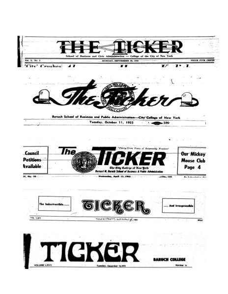
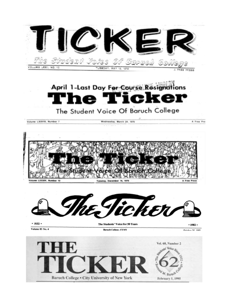
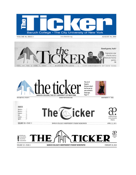
In The Ticker’s 93-year history, it has had close to twenty different logos, ranging from flowing scripts to bold san-serifs, and featured a variety of logos for anniversaries and “The Tickler” — the April Fools edition of The Ticker.
This semester, I am excited to share a new logo for The Ticker that draws on the font from the paper’s original logo and incorporates the vertical campus image that has become synonymous with The Ticker.
The original logo for The Ticker prominently featured a stock ticker with ribbon, the newspaper’s namesake.
When The Ticker was founded in 1932, Baruch was the business school for the City College of New York, not an independent college.
The newspaper sought to use the ticker graphic, which reports transaction and price data for security, to capture the business identity of the school. However, it wasn’t until 1989 that The Ticker’s business section was established.
Throughout The Ticker’s history, the ticker graphic was featured prominently in some logos and omitted entirely in others.
The William and Anita Newman Vertical Campus opened on August 27, 2001, and quickly became symbolic of Baruch’s identity as a college.
In 2006, The Ticker masthead reimagined the newspaper’s logo and made the outline of the vertical building The Ticker’s icon.
Since the adaptation of the vertical building, there have been two other logo variations.
When I first joined The Ticker in August of 2021, my first semester as a freshman at Baruch, I was a writer and copy editor.
In 2022, The Ticker turned 90, and I was given the opportunity to run a semester-long column profiling Ticker alums for the occasion.
Learning from past members of The Ticker, hearing how it shaped their lives and seeing the newspaper through their eyes made me fall in love with The Ticker.
As part of my work on the column, I spent time reading articles and looking at the art and photographs produced by the interviewees.
This allowed me to learn about The Ticker — and Baruch’s — history and introduced me to The Ticker’s many logos.
In reimagining the logo, I hope to celebrate The Ticker’s recent successes and rich history.
The logo represents the old, the contemporary and the new growth our masthead continues to strive for.


